|
|
|---|
Thursday, November 29, 2007
 Oooh, vintage typeface and graphics!
Antiquated styles, Sunday dinner out for a dollar, "jaunty, gay-looking caps", and corny college humor!
Does it get any better than that??
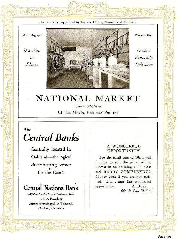
Yes, I could easily linger over the student and faculty data and photos in the first 600 or so pages of this tattered yearbook, but I think it's towards the back of the book where the action is.
That's where the advertisements from the local businesses are, the ones that might tell a slightly different story of life in the twenties.
That I've spent lots of time in Berkeley certainly sweetens it for me, but I'm hoping this will give you a kick as well.
Dig in... 


Labels: advertising, vintage graphics
0 Comments:
Subscribe to:
Post Comments (Atom)

